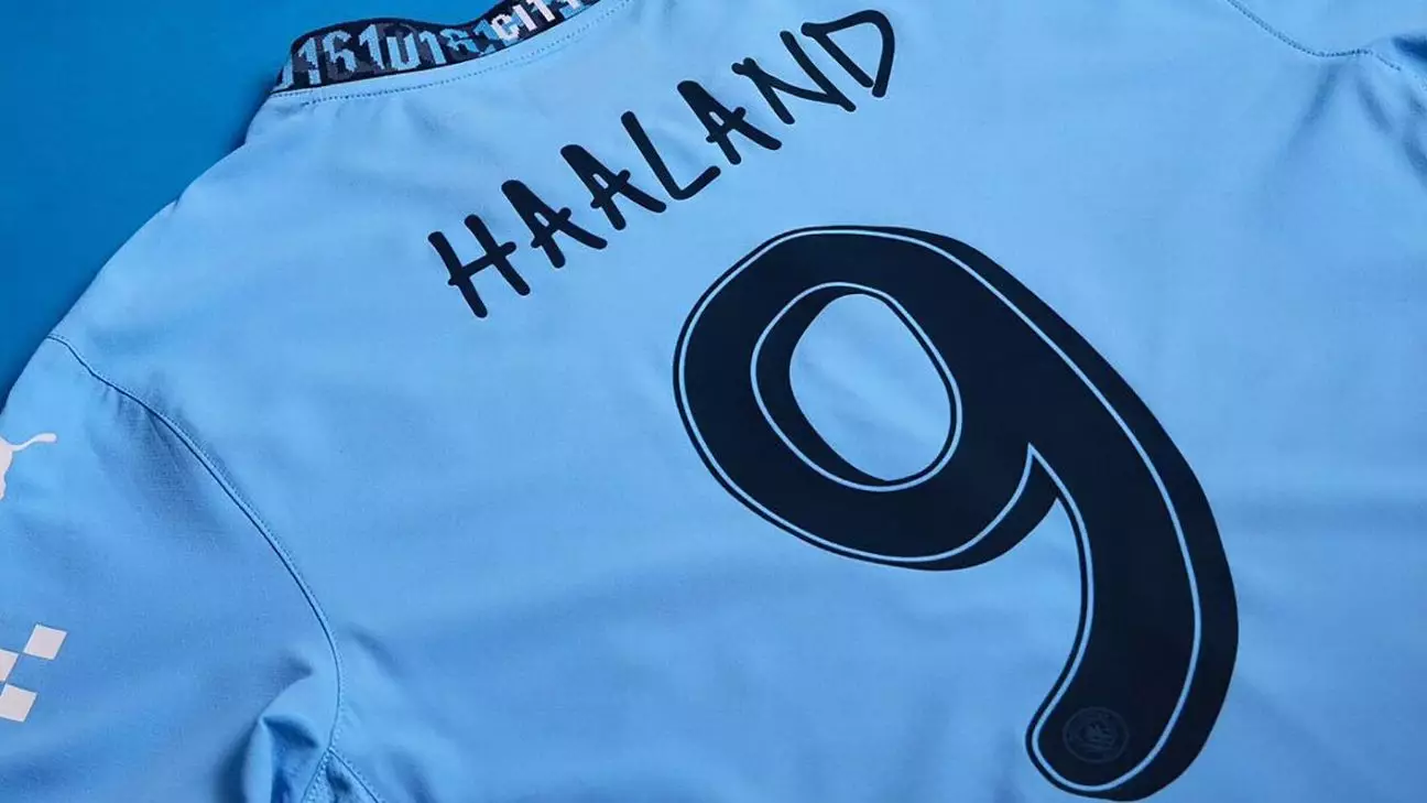
Manchester City, the reigning Premier League champions, recently unveiled a custom font designed by musician Noel Gallagher for their 2024-25 season kits. The font is inspired by Gallagher’s handwriting and will be used for player names and numbers on the kits.
Collaborating with a renowned musician like Noel Gallagher to create a unique font is certainly a bold move by Manchester City. However, while it adds a personal touch to the kits, there is a concern about the readability of the font. The design, although distinctive, draws comparisons to the infamous Comic Sans font, which is often criticized for its lack of professionalism.
The 2024-25 Manchester City home kit, designed by Puma, features the local “0161” phone dialling code as a nod to the city of Manchester. The incorporation of this detail into the kit adds a sense of local pride and identity. The hand-drawn typeface created by Gallagher will be worn by the men’s team in Champions League and domestic cup fixtures, further emphasizing the collaboration.
While Manchester City’s custom font collaboration with Noel Gallagher is unique, other clubs and national teams have also experimented with custom fonts on their kits. Real Madrid, for example, introduced an Arabesque lettering style on their 2024-25 home kit. However, the success of these custom fonts can vary, as seen with Norway’s national team font inspired by ancient Nordic runes, which posed readability issues during matches.
One of the key considerations when designing a custom font for sports kits is legibility. Fonts that are difficult to read from a distance can hinder the viewing experience, especially during fast-paced matches. While creative design elements are important, practicality and functionality should not be sacrificed for the sake of aesthetics.
Manchester City’s collaboration with Noel Gallagher to create a custom font for their 2024-25 season kits is a creative and innovative concept. However, the potential readability issues and comparisons to Comic Sans raise concerns about the practicality of the design. As clubs continue to explore new ways to differentiate their kits, finding a balance between creativity and functionality will be crucial in creating a successful and memorable custom font.