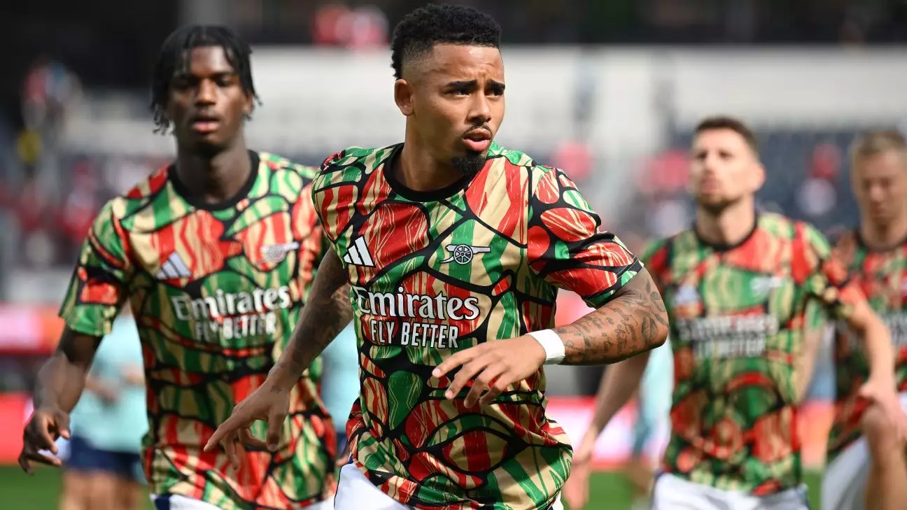
Football clubs not only showcase their colors on the pitch with traditional home and away jerseys but also have a unique opportunity to express their creativity through pre-match apparel. These warmup kits offer designers a chance to push boundaries, experiment with bold ideas, and make a statement that captivates attention.
Aesthetic Triumphs and Tribulations
While some warmup kits are hailed as masterpieces, others miss the mark completely. The freedom given to designers can either result in a sublime creation or veer into the realm of the ridiculous. Let’s take a closer look at some of the warmup kits worn by star players in European leagues this season, ranging from the sublime to the absurd.
Iconic Designs on Display
The warmup kit of Milan stands out with its off-white base color overlaid with a golden pattern reminiscent of a freshly raked golf bunker. Ajax’s intricate pattern featuring the three X’s of Amsterdam’s official flag carries a symbolic meaning but couldn’t shield the team from a disappointing season. Arsenal’s bold take on African heritage, following their successful away kit, pushes the boundaries while capturing attention.
Barça’s dark blue ensemble with gold trim exudes elegance, albeit with a neckline reminiscent of baby clothing. Chelsea’s “molten metal” concept continues to divide opinions, showcasing a scattergun graphic that mesmerizes viewers. Meanwhile, the Turkish club’s vibrant pre-match shirt showcases a unique striped pattern that reimagines their traditional colors.
Juventus embraces a celestial motif with a lunar eclipse pattern, offering a minimalist yet captivating design. Liverpool’s pre-match shirt combines the club’s traditional colors with vibrant yellow trim, creating a visually appealing look. Lyon’s graphic design inspired by traditional Japanese art strikes a balance between tasteful and visually engaging.
Modern Revamps and Retro Vibes
Newcastle’s modern interpretation of their nickname, the Magpies, features a feather-covered jersey in a striking black-and-white design. Real Madrid’s stripped-down interpretation of their iconic home colors adds a touch of nostalgia with a star-shaped graphic. Sporting a violet base with a geometric pattern, Sevilla’s warmup shirt exudes elegance and sophistication.
On the flip side, Bayern Munich’s jagged mess of a warmup shirt misses the mark with a design that lacks appeal. Inter Milan’s experimental use of traditional colors results in a blotchy and uninspiring design that falls short of expectations. Paris Saint-Germain’s faux-paint splatter pattern appears chaotic and overwhelming, lacking cohesion and visual harmony.
Tottenham Hotspur and Inter Milan’s similar designs featuring abstract patterns come across as uninspired and lack creativity. West Ham United’s questionable bleach dye effect on their warmup shirt falls flat, resembling a disastrous outcome rather than a deliberate design choice.
The world of warmup kits in European football is a mix of artistic triumphs and design missteps. While some clubs manage to strike the perfect balance between creativity and tradition, others fall victim to over-the-top designs or lackluster concepts. Ultimately, the appeal of a warmup kit lies in its ability to capture attention, evoke emotions, and leave a lasting impression on fans and critics alike. Art truly knows no bounds, even when it comes to football apparel design.

